

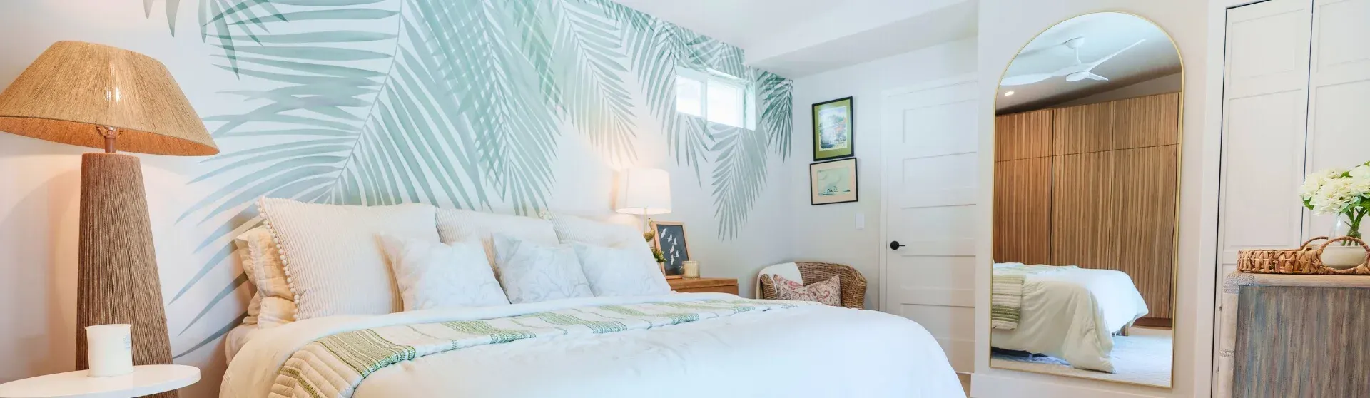
What Is an ADU and Why Color Matters
An Accessory Dwelling Unit (ADU) is a self-contained dwelling that provides complete, independent living facilities on the same lot as a primary residence. ADUs commonly serve as rental homes, guest houses, or in-law suites. In ADUs often have a compact floor plan, including garage conversions and custom small homes, color choices strongly influence how spacious, comfortable, and functional the interior feels. Guidance from Interior design emphasizes that light, neutral colors reflect natural light and visually expand compact interiors, helping open-concept living areas feel airier while complementing thoughtful layouts and smart furniture placement.
Neutral palettes also provide a flexible foundation, allowing homeowners to personalize spaces with layered lighting, multifunctional furniture, and built-in cabinetry without overwhelming the layout or compromising property value. Popular ADU interior design styles, including Scandinavian, Bohemian, and Industrial, use intentional color restraint and cohesive palettes to enhance livability while supporting rental appeal. Subtle accents such as soft gray and navy add character and depth without narrowing the appeal for renters or guests. These combinations suit ADUs intended as in-law apartments or long-term rentals, although homeowners should confirm rental requirements with the housing and planning authorities responsible for their property.
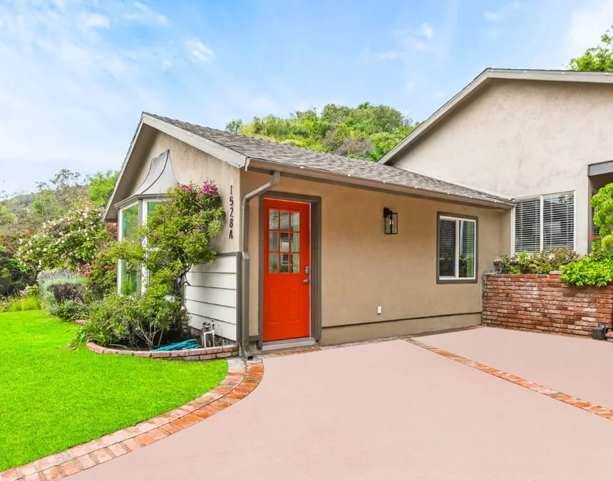
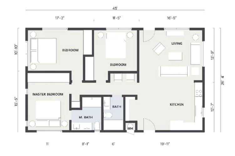
In compact ADUs, a consistent, light color palette unifies open-plan layouts and makes the space feel larger, helping maximize everyday livability and long-term rental appeal.
Beyond Aesthetics: How Color Impacts Functionality and Feel in Small Spaces
In small living environments such as ADUs, color affects how a space feels and supports its functions, especially in open-plan layouts or compact footprints shaped by California’s ADU laws. Light, cool colors, including whites, soft grays, and pale neutrals, visually recede, helping walls seem farther apart and making compact rooms with vaulted ceilings or glass walls feel less confined. A consistent palette throughout the ADU improves visual flow, particularly when incorporating wall-mounted shelving, vertical storage, or multipurpose zones that might otherwise create visual clutter.
Limiting a palette to one dominant color, one secondary color, and restrained accents can help prevent visual overload in tight spaces, following the widely used 60-30-10 rule (The Spruce). Paired with reflective finishes, French doors, and daylight from skylights or large windows, lighter hues amplify available light and improve perceived spaciousness. Window and skylight selections should also meet applicable Title 24 energy requirements rather than assume that additional glazing automatically improves energy performance.
The Goal: Creating Harmony, Maximizing Space, and Reflecting Style
An ADU color scheme should create harmony, enhance perceived spaciousness, and express a chosen design style while accommodating practical considerations, including California ADU laws and building codes that affect layout and exterior design. Modern and minimalist ADUs often use light, neutral palettes to emphasize clean lines and openness, complementing modern ADU exteriors, simple roof forms, and energy-efficient appliances. By contrast, Mediterranean, Spanish, and farmhouse-style ADUs favor warmer hues and textured finishes, such as stucco or shiplap walls, to create a timeless, distinctive appearance that connects interior and outdoor spaces.
Across styles, structured approaches such as monochromatic, complementary, and analogous color schemes help keep compact layouts cohesive, regardless of lot size or floor plan constraints. One widely used framework is the 60-30-10 rule, which suggests assigning 60% of a room’s palette to a dominant color, 30% to a secondary color, and 10% to an accent, maintaining balance without visual overload (The Spruce).
Scandinavian, Bohemian, and Industrial styles benefit from intentional color planning, particularly when incorporating wall shelves, vertical gardens, or smart features. A cohesive palette helps these elements work together and prevents compact ADUs from feeling cluttered, disjointed, or visually overwhelming.
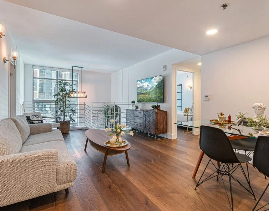
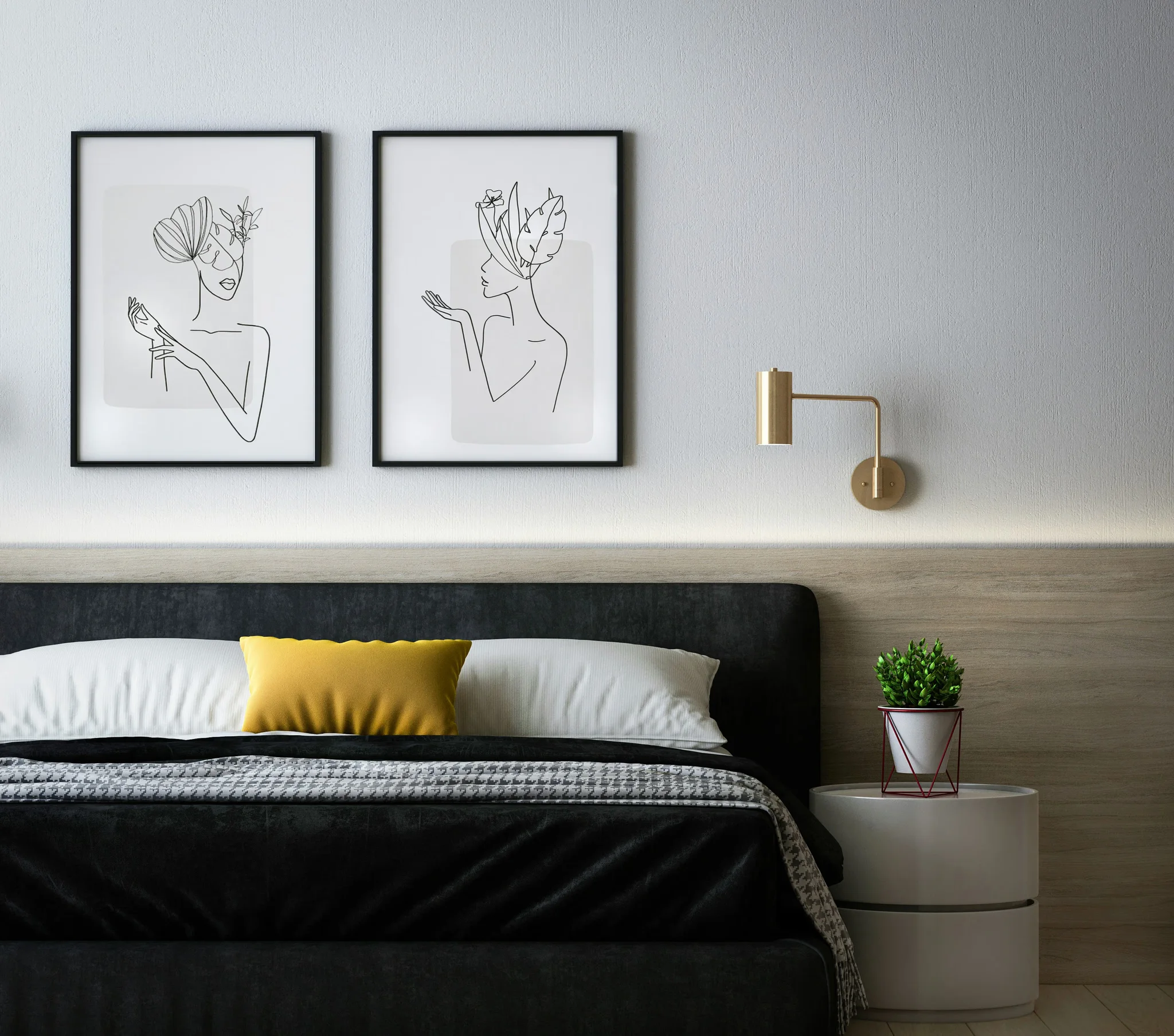
Harmonized color schemes and warm wood tones create visual continuity, helping small ADUs feel intentional, calm, and well proportioned rather than segmented or crowded.
Foundational Color Principles for ADUs
Successful ADU color schemes balance comfort, openness, and versatility in small spaces while complementing smart technology and environmentally conscious features. Warm colors such as red, orange, and yellow can create intimacy and coziness, but using them sparingly helps prevent compact rooms from feeling enclosed, particularly in prefabricated ADUs or shipping container homes with limited square footage. Cool colors, including blue, green, and gray, can create a calmer, more open impression, helping small interiors feel lighter and more spacious regardless of exterior siding choices or interior layout constraints.
Neutral palettes, particularly whites, light grays, and soft beiges, reflect daylight and offer a flexible backdrop for rental interiors, accommodating varied furnishings, wall beds, and storage ottomans. Within that foundation, soft gray and navy blue can serve as secondary or accent tones, adding depth and character without overwhelming the space. Consistent colors across rooms also strengthen visual cohesion and make an ADU feel more unified. Repeating finishes can simplify purchasing and touch-ups, while compliance with California ADU laws remains a separate planning and construction requirement.
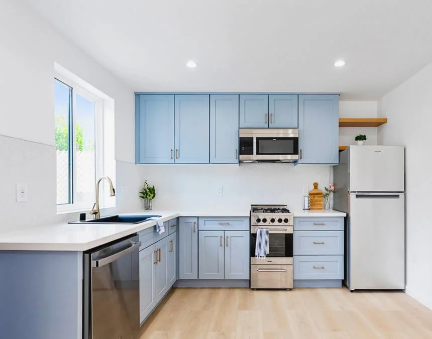
Pairing warm materials with a light, neutral foundation creates balance, preserving brightness while keeping small ADUs from feeling cold or sterile.
Understanding Color Theory Basics for ADU Homeowners
Understanding basic color theory helps homeowners make confident interior design decisions in small spaces such as ADUs, particularly when layouts are shaped by California’s ADU laws and strict building code requirements. Primary, secondary, and tertiary colors provide the foundation for harmonious palettes, explaining how colors relate to and complement one another, whether a room features the ADU features a coastal design style, modern finishes, or a traditional layout. Warm undertones, such as red, orange, and yellow, can make spaces feel cozier, while cool undertones, including blue, green, and gray, visually recede and help compact interiors feel more open.
Neutral interiors can appeal to a broad range of renters by providing flexibility and avoiding overly personal design choices. To add character without visual clutter, consider restrained tones such as soft gray or navy within an otherwise light, neutral palette. This approach can make ADUs feel larger and airier, and homeowners can explore different combinations during 3D design consultations or virtual model planning.
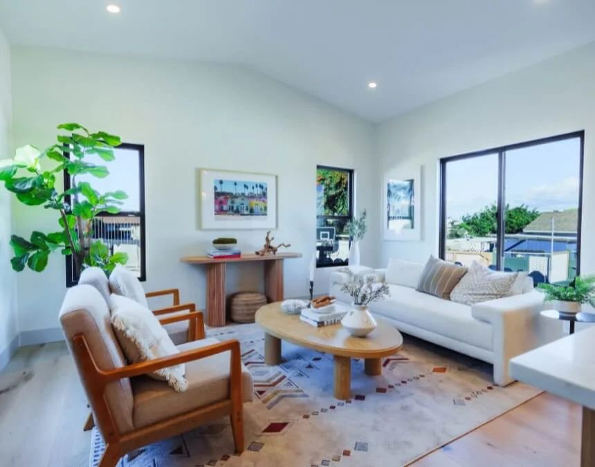
Strategically blending warm and cool tones helps shape the feel of a small ADU: cool hues visually expand the space, while warm accents add comfort without making it feel enclosed.
Color Psychology in Smaller Living Areas
Color psychology helps explain how small ADU interiors are perceived and experienced, including homes designed under California’s ADU laws and strict building code requirements. Warm tones such as reds, oranges, and yellows can create comfort and intimacy, but extensive use in compact layouts may make rooms feel enclosed, especially where square footage is limited or ceilings are low. Cool tones, including blues, greens, and soft grays, tend to recede visually, helping small living areas feel calmer, lighter, and more expansive. These interior effects can complement a range of exterior materials, including clapboard lap siding and metal roofing.
Whites, light grays, and soft pastels can reflect natural light and reduce visual weight, making ADUs feel brighter and airier while providing a backdrop for energy-conscious features such as solar panels or smart thermostats. Balanced schemes, including monochromatic and analogous palettes, help limit visual noise in small spaces. Used sparingly, accent colors enhance the interior without overwhelming the overall design.
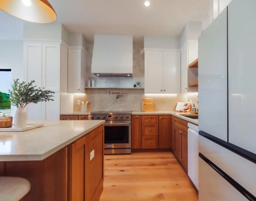
Light, warm neutrals support comfort and perceived openness, helping compact living environments feel calmer, more welcoming, and more inviting.
Exterior ADU Colors: Harmonizing with Your Property and Neighborhood
Choosing exterior colors thoughtfully helps an ADU maintain curb appeal, neighborhood compatibility, and long-term comfort. In the greater Los Angeles area, homeowners considering Craftsman-style ADUs can explore deeper body colors with contrasting trim to highlight architectural details and complement surrounding homes. Coordinating the ADU’s palette with the primary residence through compatible colors, materials, or trim helps the structure feel intentional rather than visually disconnected.
Lighter exterior colors generally reflect more sunlight and absorb less heat, a useful consideration in Southern California that may improve indoor comfort and energy efficiency (Bob Vila). Referenced design data identifies white (23%), gray (19%), and beige (10%) as popular exterior colors among surveyed homeowners, illustrating their versatility and broad appeal (Architectural Digest). Soft gray and navy can add depth without dominating the home, while earthy, natural hues complement landscape-sensitive design. However, color alone does not establish a finish’s environmental performance, durability, or suitability for a particular climate.
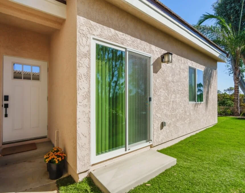
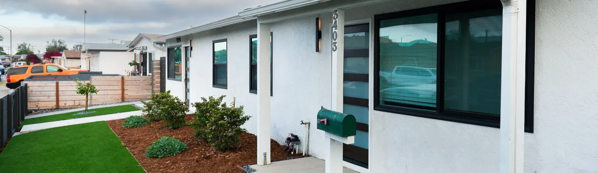
A harmonious exterior palette strengthens curb appeal and can support applicable design requirements, helping an ADU feel like an intentional extension of the main home.
Blending In: Matching Your ADU to the Main Residence
Coordinating an ADU to the main residence is often both a design with the primary home can support visual cohesion, but exterior compatibility requirements depend on applicable law and project-specific rules. Check with the local planning department and review any enforceable HOA requirements. Compatible rooflines, trim colors, window styles, and siding materials can help the ADU feel integrated with the property rather than added as an afterthought.
Stick-built ADUs may offer more flexibility for matching finishes and proportions than prefab or modular units, although available options vary by manufacturer and design. Thoughtful landscaping also helps connect the structures: coordinated plant palettes, hardscaping materials, and sightlines can visually unite an ADU and primary home even when they remain physically separate.
Standing Out (Tastefully): Creating Intentional Contrast
Intentional contrast gives an ADU its own identity while keeping it visually connected to the property. Contrasting trim and window frames, often black or crisp white, can define architectural lines in modern and industrial-inspired ADUs. Bohemian-style interiors introduce contrast through earthy accents such as terracotta, mustard, and teal, layered over neutral bases for warmth and interest without overwhelming small spaces. Scandinavian design takes a subtler approach, combining light neutrals with natural wood tones to preserve brightness while adding depth and texture. Across styles, restrained bold accents and neutral foundations help maintain balance in foundations helps maintain balance and broad appeal in compact ADU layouts.
The Role of Natural Light and Environment on Exterior Colors
Natural light strongly influences how exterior ADU colors appear. Light paint reflects sunlight and can make surfaces look brighter throughout the day, particularly in sunny regions such as Southern California. Large windows, sliding glass doors, and indoor-outdoor openings also shape how the interior palette connects with surrounding exterior finishes. Orientation matters: north-facing walls may appear cooler and more muted, while south- and west-facing elevations often look warmer and brighter in direct sun. Recessed windows and architectural shadows introduce depth and contrast, making neutral or pale surfaces feel more dynamic rather than flat. Test paint samples on multiple elevations to assess these changing conditions before selecting a final color.
Practical Considerations for Exterior Paint
Exterior paint color shapes first impressions and can influence perceived quality and rental appeal, making neutral palettes a versatile choice for ADUs. In warm parts of California, lighter colors generally absorb less solar heat, potentially improving indoor comfort and reducing cooling demand. Highly reflective coatings can strengthen this effect, although any claim of surface temperatures up to 50°F lower than darker finishes should be checked against product-specific testing and site conditions. In coastal or sun-exposed locations, paint quality matters as much as color: UV exposure, salt air, and moisture can accelerate fading and wear, making suitable coatings, surface preparation, and maintenance essential.
Interior ADU Colors: Maximizing Space, Light, and Livability
Interior colors strongly influence how spacious and comfortable an ADU feels, particularly within a compact footprint. Light neutrals, including whites, soft grays, and pale beiges, reflect daylight and visually expand small interiors, helping rooms feel open rather than confined. Soft gray or navy blue can add depth and sophistication without overwhelming the space, preserving flexibility for renters and guests. A consistent palette throughout the ADU improves visual flow, while natural wood tones introduce warmth and balance. Together, these choices help prevent pale interiors from feeling sterile and create a calm, comfortable setting for everyday living.
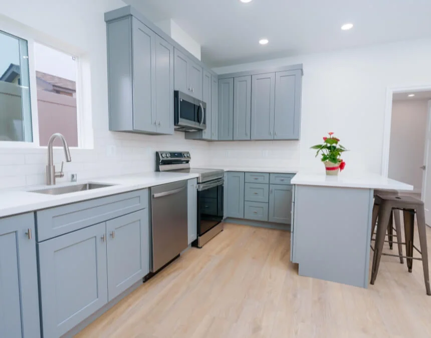
Light-reflective finishes and pale palettes help distribute natural light, making compact ADU interiors feel brighter, more open, and airier.
Strategies for Making Small Spaces Feel Larger and Brighter
Making a small ADU feel larger starts with thoughtful natural and artificial lighting, since well-lit spaces often appear more open and airy. Light wall colors reflect available daylight throughout the unit, helping visually expand compact interiors. Reflective materials, including mirrors, glass, and glossy or satin paint finishes, can amplify that light and add perceived depth without increasing square footage. Consider their placement carefully to manage glare. Vertical storage and wall-mounted or floating furniture also preserve usable floor area, reduce visual clutter, and reinforce the sense of openness that makes small ADU layouts more comfortable.
The Power of Accent Walls and Strategic Color Pops
Accent walls introduce personality into an ADU without overwhelming a small space or increasing costs by creating a clear focal point while keeping the surrounding palette calm and cohesive. For balance, the 60-30-10 rule suggests assigning 60% of the palette to a dominant color, 30% to a secondary color, and 10% to an accent. These proportions offer a flexible guide rather than a strict measurement. Used thoughtfully, a navy feature wall or muted green backsplash can add depth and visual interest without sacrificing the sense of openness that makes compact ADU interiors comfortable.
Color Palettes for Popular ADU Architectural Styles
Modern ADU Colors
Modern ADUs often use light neutrals, including white, soft gray, and beige, with subtle contrast to emphasize clean lines and open layouts. Natural wood tones and restrained accents add warmth without disrupting the minimalist aesthetic, creating interiors that feel calm, spacious, and contemporary. This approach limits visual clutter while providing a flexible backdrop for renters and long-term occupants.
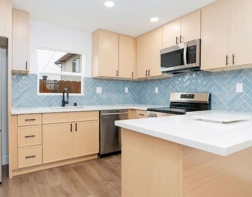
Modern ADUs benefit from restrained contrast: neutral foundations with subtle depth keep interiors visually clean while supporting broad rental and resale appeal.
Farmhouse ADU Colors
Farmhouse-style ADUs favor warm, neutral foundations, often white or light cream, paired with black trim or muted earth tones for a cozy, lived-in feel. Color contrast highlights natural materials such as wood beams, shiplap, and stone, reinforcing rustic character while maintaining visual balance within a smaller footprint.
Craftsman ADU Colors
Craftsman ADUs often feature earthy palettes, including warm browns, deep greens, and muted blues, paired with lighter trim for contrast. These colors complement natural materials and detailed architectural elements, helping the structure feel grounded rather than visually busy. In Southern California, homeowners can use style is especially popular for blending ADUs as a starting point for integrating this style into established neighborhoods.
Coastal ADU Colors
Coastal ADU palettes combine whites, sandy beiges, and soft blues or greens to reflect light and create a relaxed, airy atmosphere. This approach can be especially suitable for Los Angeles and other coastal areas, where lighter colors enhance natural brightness and echo the surrounding environment. The result is a serene, open appearance that supports interior comfort and cohesive curb appeal.
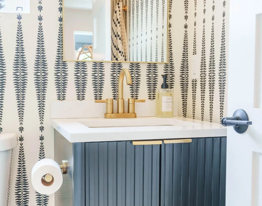
Coastal-inspired palettes use soft blues and light neutrals to reflect daylight, helping small ADUs feel fresh, airy, and expansive.
Scandinavian ADU Colors
Scandinavian-style ADUs combine white, light gray, and pale neutrals with natural wood finishes to balance brightness and warmth. This deliberately minimal palette reflects available daylight and helps compact interiors feel larger and more functional. Consistent colors across surfaces preserve the clean, cohesive appearance associated with the style while allowing materials and textures to add interest.
Spanish Revival ADU Colors
Spanish Revival ADUs commonly use warm, earthy hues such as soft terracotta, cream, and muted beige, often paired with stucco finishes for texture and depth. These combinations create a timeless, elegant appearance, while lighter tones keep smaller structures from feeling visually heavy. In Southern California, the style can connect traditional architectural character with contemporary comfort and livability.
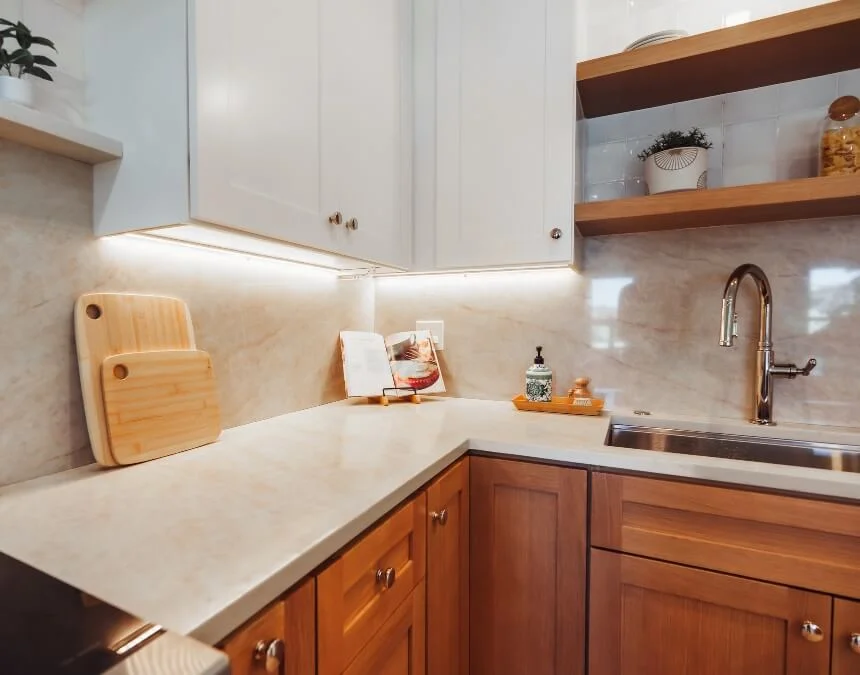
Spanish Revival palettes pair warm, earthy tones with textured finishes for depth and character, using lighter hues to keep small ADUs from feeling visually heavy.
Practical Considerations and Expert Tips for Choosing ADU Colors
When choosing ADU colors, avoid generic “landlord special” schemes that rely on flat, undifferentiated beige or gray, which can leave small spaces feeling lifeless. Instead, begin with flexible neutral foundations, such as white, soft gray, or light beige, then add personality through texture, natural wood tones, and restrained accents. This approach preserves broad appeal while giving the ADU an intentional, considered appearance. Although thoughtful design can support rental desirability and perceived value, outcomes also depend on location, condition, pricing, and the property’s overall features.
Conclusion: Creating Your Perfect ADU Color Story
A thoughtful color scheme helps shape an ADU’s comfort, functionality, and lasting appeal, especially in compact spaces where each design choice has a noticeable effect. Light, neutral foundations and carefully selected accents can make interiors feel larger, calmer, and more adaptable for renters and guests. Consistent colors throughout the ADU strengthen visual flow and cohesion, helping separate areas feel connected and thoughtfully designed rather than fragmented or visually crowded.
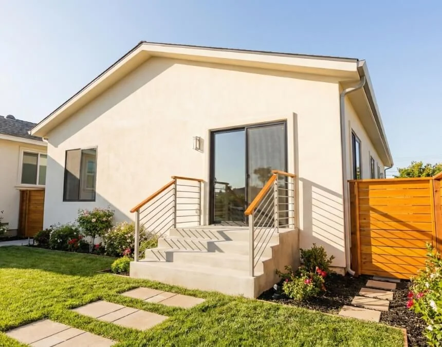
A cohesive color palette connects every space, reinforcing flow and comfort while supporting lasting appeal for renters and homeowners alike.
Frequently Asked Questions
Light neutrals such as white, soft gray, beige, and pale pastels are versatile choices for ADUs because they reflect daylight and help small spaces feel larger and more open. Replacing an extensive dark palette with lighter tones can noticeably improve perceived spaciousness. Accents such as navy blue or muted green add depth and character without overwhelming compact interiors.
The classic 60-30-10 rule assigns 60% of a palette to a dominant color, 30% to a secondary color, and 10% to an accent. A fourth color can share the 10% accent portion, dividing it into two smaller accents rather than expanding their overall presence. This flexible approach helps preserve visual balance and prevents small spaces, including ADUs, from feeling cluttered or chaotic.
Neutral, light-colored interiors can appeal to renters seeking clean, bright, adaptable spaces. Whites, light grays, and warm neutrals provide a flexible backdrop that can feel modern and welcoming, although individual preferences vary. Natural wood tones and restrained accents add personality, helping avoid a sterile “landlord special” appearance while maintaining broad rental appeal.
Light neutrals such as white, gray, and beige offer versatile options for ADU exteriors. A Houzz study cited by Architectural Digest reported white (23%), gray (19%), and beige (10%) as popular exterior colors, often complemented by contrasting trim. In warmer parts of California, lighter finishes can also reflect more sunlight and reduce heat absorption, with potential cooling benefits depending on the coating and building.
Color choices influence how spacious, cohesive, and inviting an ADU appears. Light and cool tones visually recede, helping compact spaces feel larger, while consistent palettes improve flow and reduce fragmentation. Outside, colors that complement or intentionally contrast with the main home strengthen curb appeal and help the ADU read as a purposeful addition to the property rather than an afterthought.